Private Credit in 10 Charts
Sometimes pictures speak louder than words. Enjoy these 10 charts and graphs that speak volumes about private credit's growth and rapid adoption amongst investors.

When it comes to alternative assets that are easy to understand, private credit doesn’t exactly top the list (a list that includes real estate, precious metals, artwork, etc.). From an investor’s perspective, it can be challenging to understand how the private credit industry works, how it performs vs. other asset classes, what the trends indicate, and where opportunity lies.
We at Heron Finance pride ourselves on bringing transparency to the private credit sector, which is why we publish insightful content that peeks behind the curtain of this often misunderstood industry.
However, we thought it might be valuable to share our thoughts on private credit in a different way: through charts and graphs.
They say a picture is worth a thousand words. Well, below we have 10 charts and graphs–so that’s the equivalent of 10,000 words of insight into private credit’s growth, popularity, and positioning vs. other asset classes!
Chart 1: Private Credit as a Portfolio Enhancement
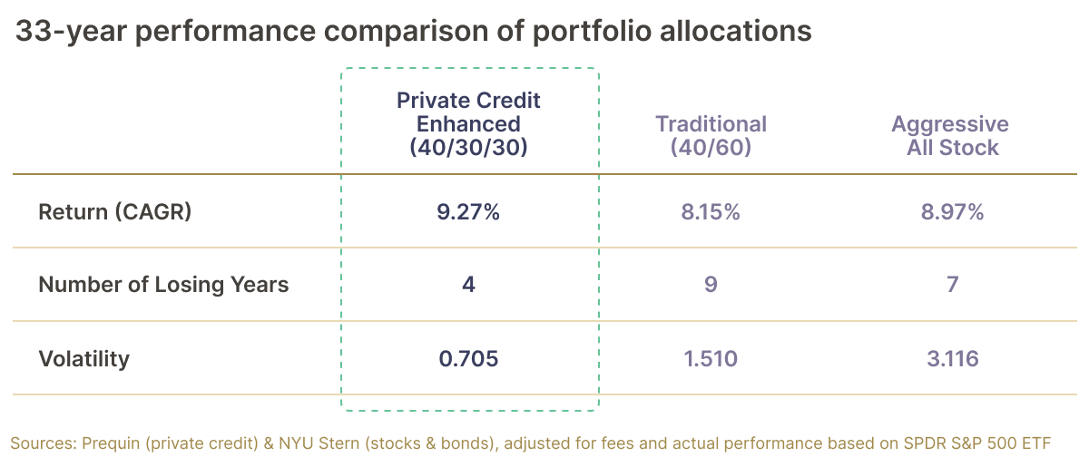
There’s been a lot of talk about the death of the 60/40 portfolio. In short, that means that investors are moving away from a traditional 60/40 stock-to-bond split.[1]
Why? Because lately stocks and bonds have grown highly correlated–meaning that as stocks decrease in value, so have bonds, and vice versa (they both have been increasing in value at time of this writing).[2]
That’s significant, because in decades prior, when stocks decrease in value, bonds would increase. This is precisely why many investors invest in bonds in the first place–to offset any stock losses during times of a recession (for example, in 2008, the S&P returned -36.55%. Meanwhile, the 1-year bond rose 20.1% during that same time).[3]
With stocks and bonds now so correlated, do bonds even diversify your stock portfolio anymore?
Enter private credit. As the chart above shows, private credit-enhanced portfolios have outperformed the traditional 60/40 split, as well as more aggressive all-stock portfolios over the last 30+ years.
And that outperformance spans several key metrics–compound annual growth rate (CAGR), the number of years the portfolio loses money, and average annual volatility (the rate at which the value of the portfolio increases or decreases). In other words, the median private credit-enhanced portfolio can generally expect to produce higher returns with lower volatility and fewer down years than a 60/40 or all-stock portfolio.
Don’t believe us? Take a look at what legendary investor Byron Wien, Vice Chairman at Blackstone has to say: “The traditional 60/40 portfolio provides insufficient diversification, as the stock-bond correlation turned positive in October 2022. These conditions have many investors wondering where else they can go. At Blackstone, we believe that these macroeconomic conditions have the potential to create a favorable market for private credit. And history tells us that private credit can bring meaningful diversification to portfolios, including the 60/40.”[4]
No wonder this is one of our favorite charts!
Chart 2: Zero Down Years
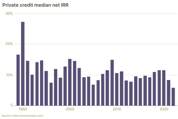
Source: data from Preqin
Nothing speaks to the consistency of an investment more than a lack of down years, and this chart speaks volumes on that front.
The median private credit fund manager has not had a single year of negative performance over the last three decades.
Yup, you read that right. How is this possible? Because like bonds, private credit produces consistent cash flow in the form of yield repayments. As long as portfolios are properly diversified, repayments should create positive net returns every single year.
Of course, there is always the risk of a rash of defaults that wipe out a given year's positive returns–that can and does happen. But on average, private credit funds have managed to structure their portfolios in such a way that the yield repayments more than balance out any losses from a default on an annual basis.
Pretty impressive stuff for anyone looking to smooth out the volatility of their investment portfolio (which by the way speaks to the lower volatility metric in Chart #1 above).
Chart 3: Private Credit’s Performance During Down Years for the S&P
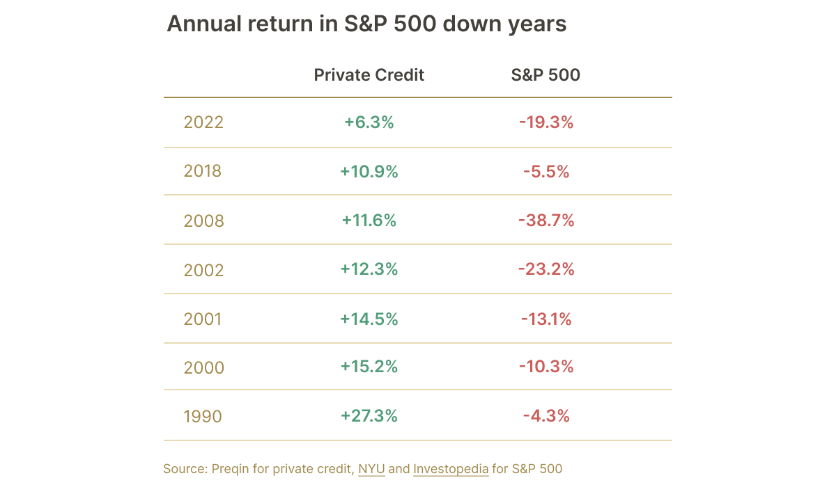
Source: data from Preqin
Piggybacking off of the last chart, this chart illustrates just how stark the disparity can be for private credit vs. the S&P, in years when S&P returns are negative.
There have been seven down years for the S&P since 1990, and (per Chart #2) the median private credit fund manager produced a positive return every single one of those years. And the spreads between private credit’s positive return and the S&P's negative return can be quite drastic. Most fall in the range of 20%-30%, with 1990 producing a 54 point swing!
The S&P can display some real volatility, and private credit outperforms the S&P in highly volatile years, as capital flows away from the stock market and into alternative investments In addition, the S&P typically falls during times of high interest rates, and private credit tends to actually perform better when interest rates rise, which is exactly what the next chart shows.
Chart 4: When Interest Rates Increase, So Does Private Credit
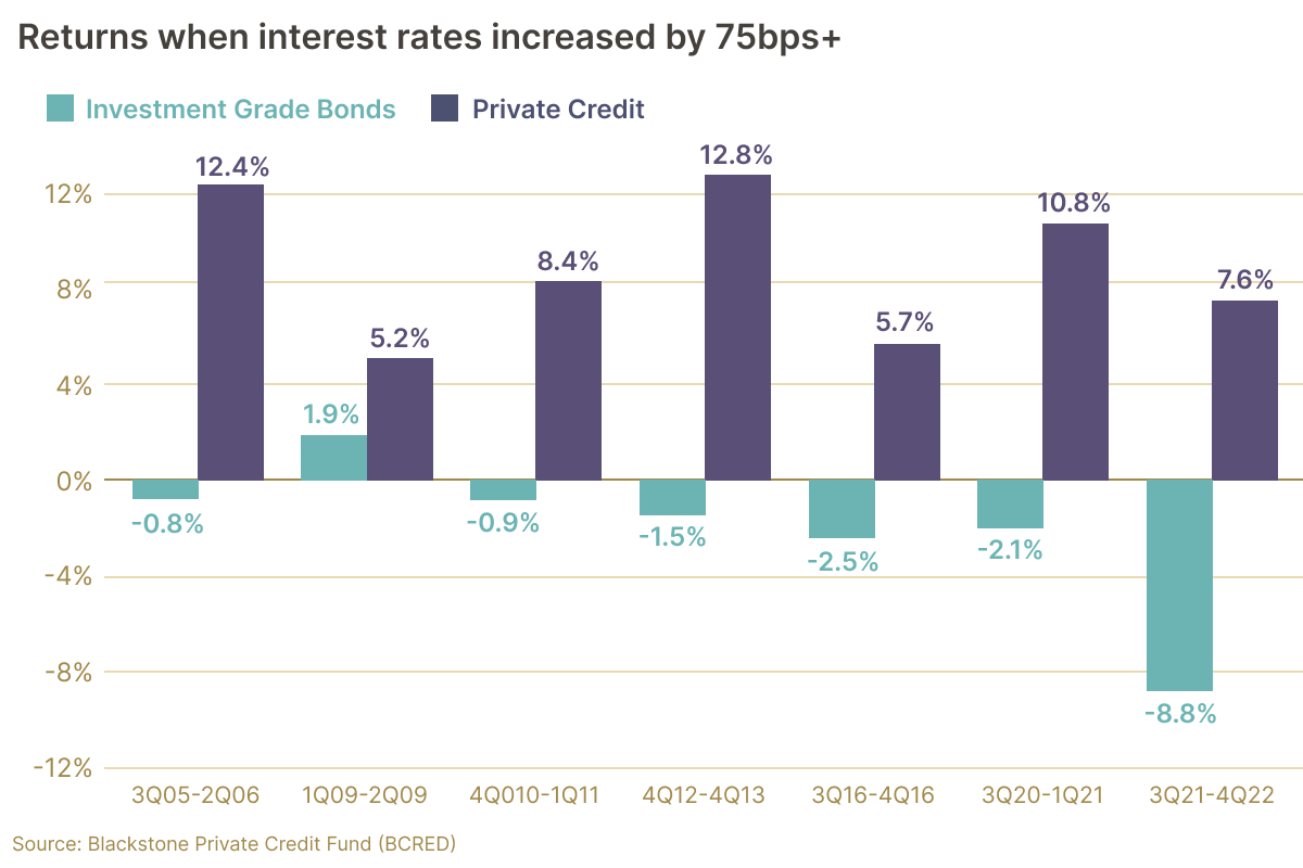
Source: Blackstone
Here is a beautiful chart that clearly illustrates how private credit can outperform during times of rising interest rates.
The x-axis represents years when interest rates rose by at least 75 basis points. Private credit excelled during those periods, most of which saw investment grade bonds (another form of debt investment) fall.
This has to do with the fact that most private credit loans are floating rate, hence the yield repayments increase as interest rates rise. Most public bonds are fixed-rate, and stock dividends do not rise or fall with interest rates. Plus, the stock market can take a severe hit during a time of rising rates, as we all discovered in 2022.
Chart 5: Fundraising Trends
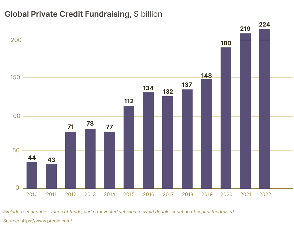
Source: data from Preqin
Who doesn’t like to be part of a growing sector? Well, according to this chart, private credit is growing by leaps and bounds.
The U.S. private credit sector raised $44 billion in 2010, and a mere 12 years later, that number ballooned to $224 billion (FY 2023 numbers have not been disclosed yet, at time of this writing). That is a massive 5x increase!
And some major names have been raising private credit funds. In 2023 alone, Blackstone raised a $400 million private credit fund,[5] Goldman Sachs announced plans to double the size of its $110 billion private credit business,[6] and Ares–a middle market private credit fund–raised $6.6 billion (illustrating that even the mid-market sector of private credit is growing).[7]
Chart 6: AUM Trends
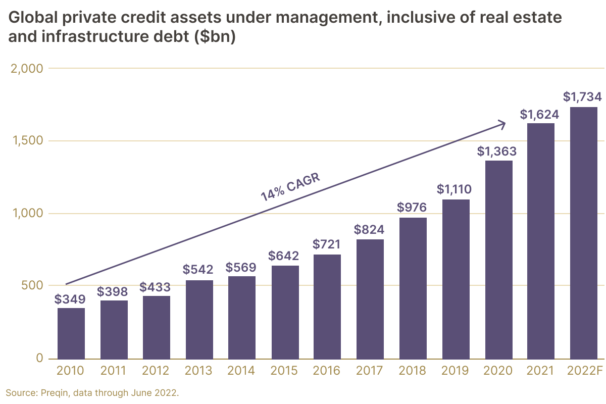
Source: data from Preqin
Private credit isn’t just growing its fundraising numbers, assets under management have also been on the upswing. As the chart above shows, the sector has produced a solid 14% CAGR from 2010-2022 (the last full year that data exists).
And the $1.7 trillion private credit market is expected to grow even further. BlackRock, the largest asset manager in the world, is predicting that private credit will double its AUM to $3.5 trillion by 2028.[8]
This chart makes sense in the context of the previous fundraising chart, as you’d expect AUM to grow alongside record fundraising numbers. Taken together, the two charts underscore an industry that is rapidly expanding.
Chart 7: Alternative Investments Comparison
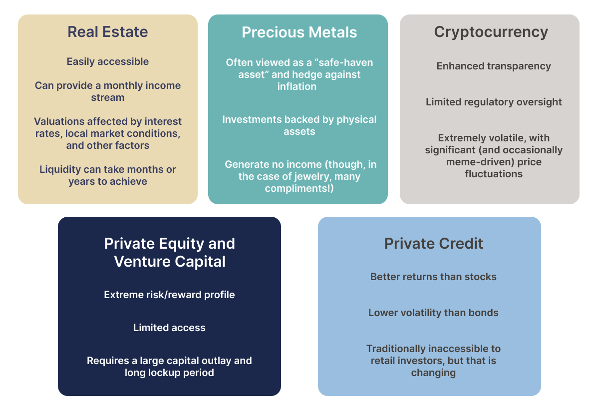
Private credit is just one of many alternative investment opportunities. We believe the asset class has unique features that make it especially attractive–such as the higher yields than traditional fixed income investments, and the regulatory tailwinds driving investor interest.
The above chart lays out those features–including both benefits and drawbacks. As we stated above, we’re big on transparency!
Here you can see some of the key components that make up each alternative asset, which can help you make up your own mind as to which you should consider including in your investment portfolio.
Chart 8: Checking Under the Credit Hood
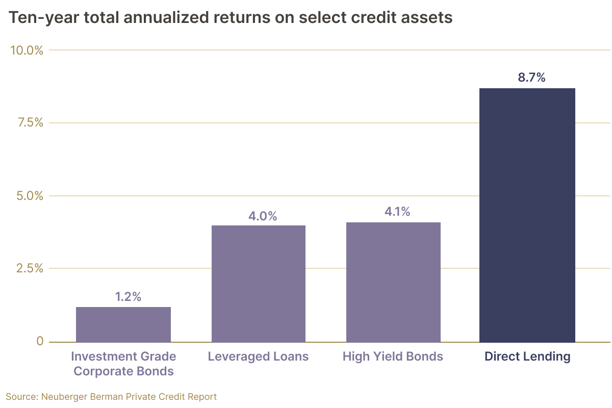
Source: Neuberger Berman
This chart takes a peek into the credit sector itself. Most private credit loans take the form of direct lending to businesses (these are the types of investments Heron Finance makes), yet there are other forms of credit as well, such as leveraged loans and different types of bonds.
As you can see from the above chart, 10-year annualized returns for direct lending vastly outperform other forms of credit. Direct lending more than doubles high yield bonds and leveraged loans!
While these credit assets all provide consistent cash flow, direct lending has produced a higher annual rate of return over the past decade, which might make it a more attractive investment for those seeking to gain exposure to the private credit asset class.
Chart 9: The Goldilocks Lending Zone
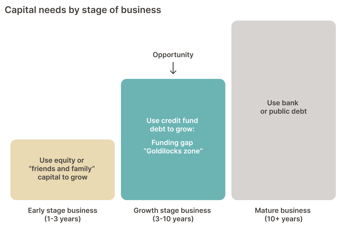
Source: Heron Finance
Shifting gears a bit, this chart focuses on what is known as ‘the Goldilocks Lending Zone.’
As the chart above indicates, when a business reaches its adolescent years (in this case, the 3-10 year range), it can become more difficult for that business to obtain a loan, as the business has often outgrown VC and angel funding, yet is typically not mature enough to obtain debt financing from established players in the market such as commercial banks.
At Heron Finance, we ensure that all of our borrowers have a track record of at least 18 months of operations. That is enough time to ensure the borrower’s assets are reliable, while still enabling us to target early-stage borrowers who may not be able to secure a bank loan, and are therefore willing to pay us higher interest rates (our target APY is 11-16% net of fees).
So in other words, we’re looking to lend to businesses in the Goldilocks lending zone (we’re willing to accept a business that is at a slightly earlier stage, hence the minimum 18 months of track record).
Chart 10: Total Addressable Market
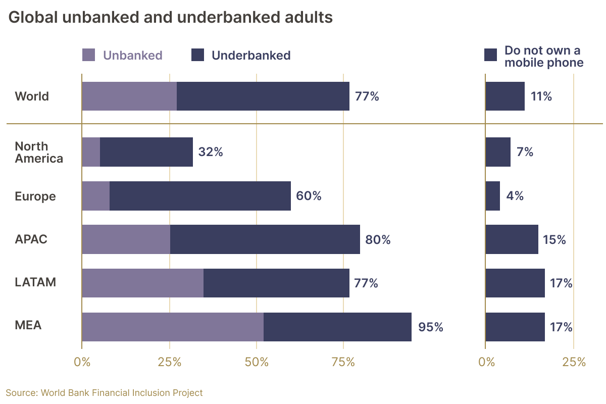
Source: World Bank
One final chart that we find interesting has to do with the total addressable market for private credit. Now technically, any company on earth is in the market for private credit (that includes public companies, which can launch special vehicles to borrow from private credit lenders).
That said, we like to look at a specific indicator which can serve as inspiration to remind us why we do what we do.
The above chart shows the global population of unbanked and underbanked. These are people with limited or no access to traditional banking services. As private credit grows in popularity, and digital innovation helps foster greater inclusion worldwide, we envision more and more of the global population ‘becoming banked.’
Just look at the percentage of individuals in each region without access to a cell phone. That is much smaller than the percentage of under and unbanked. This implies that banking-as-a-service–distributed over mobile–can have a meaningful impact on people’s lives across the globe.
At Heron Finance, we believe in a future where anyone, anywhere in the world can obtain a loan from a lender (or group of lenders). That is part of the promise of a blockchain-enabled lending platform. And it’s a big reason why we’re so proud to be the first blockchain-enabled SEC-registered robo-advisor.
There’s a long road from here to there, but Heron Finance is taking that all important first step.